Payroll to Revenue Ratio, frequently referred to as Salary to Revenue Ratio, is a productivity metric that measures how effective a business is at utilizing its labour costs to produce revenue. As with any ratio, it's always important to understand both the numerator and the denominator and how changes to either will impact the number.
For a given time period, our Labour Costs are $250,000.
For that same period, Net Sales are $500,000.
Payroll To Profit Ratio = $250,000 / $500,000 = 0.5 or 50%
Using the example above, if the $500,000 in Net Sales were achievable with only $200,000 in labour costs, then the ratio would improve to 40%.
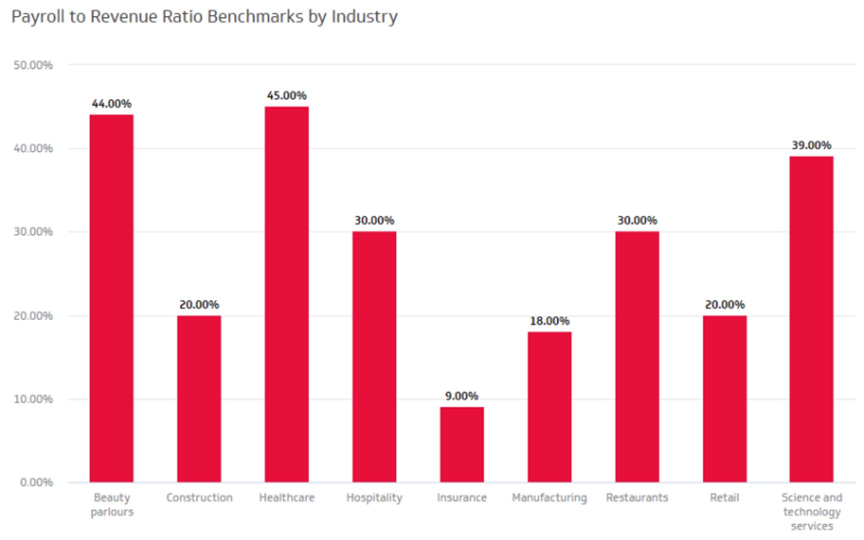
Most businesses will fall between 15% and 30% Salary to Revenue Ratio. Additionally, based on US Census data and PWC research, here are Payroll to Revenue benchmarks by industry: manufacturing at 18%, healthcare at 45%, insurance companies at 9%, while retail stores have a payroll to revenue ratio between 10% - 12%. Take a look at the chart for a breakdown of Payroll to Revenue Ratio by industry:
Here's one way you can look at your data. Track your labour costs against your net sales to derive your Payroll to Revenue Ratio and use this data to notice changes in your ratio over time. The chart shows an example of what your Payroll to Revenue Ratio could look like:
Did you know that most companies state payroll as their biggest cost? Payroll expenses can amount to over 70% of total operating expenses. This is often justified. Your full-time employees and contractors are the driving force bringing your mission and vision to life.
Payroll expenses are your investment in the success of your company through its employees. As with any other expense, it is helpful to know the return on investment.
Use Payroll to Revenue Ratio to determine the return on salary paid to your employees. By tracking this data regularly, you gain insight into how effectively you generate revenue. You can also use this data as a planning tool to forecast salaries for the upcoming year.
This metric is easily comparable within industries and geographies, and should also be tracked over time to understand trends in workforce productivity, such as the impact of training, or staffing changes.
Directionally, you want the Payroll To Profit Ratio to decrease, which means your ability to utilize your workforce to generate Revenue is more efficient.